
Challenges and Target User
For the Engie Impact Portal, we needed to design a visualization framework/system that could track a client’s sustainability goals both at a glance and in detail. The target users are company employees in energy management positions.
The Portal is an ongoing project that was kicked off in 2019, before I joined the team. In 2019, through user experience audits, user interviews, research synthesis, an interaction model, and low fidelity designs, the team defined the design opportunities to focus on goal-setting features, tracking and analysis, data management, and initiative management.
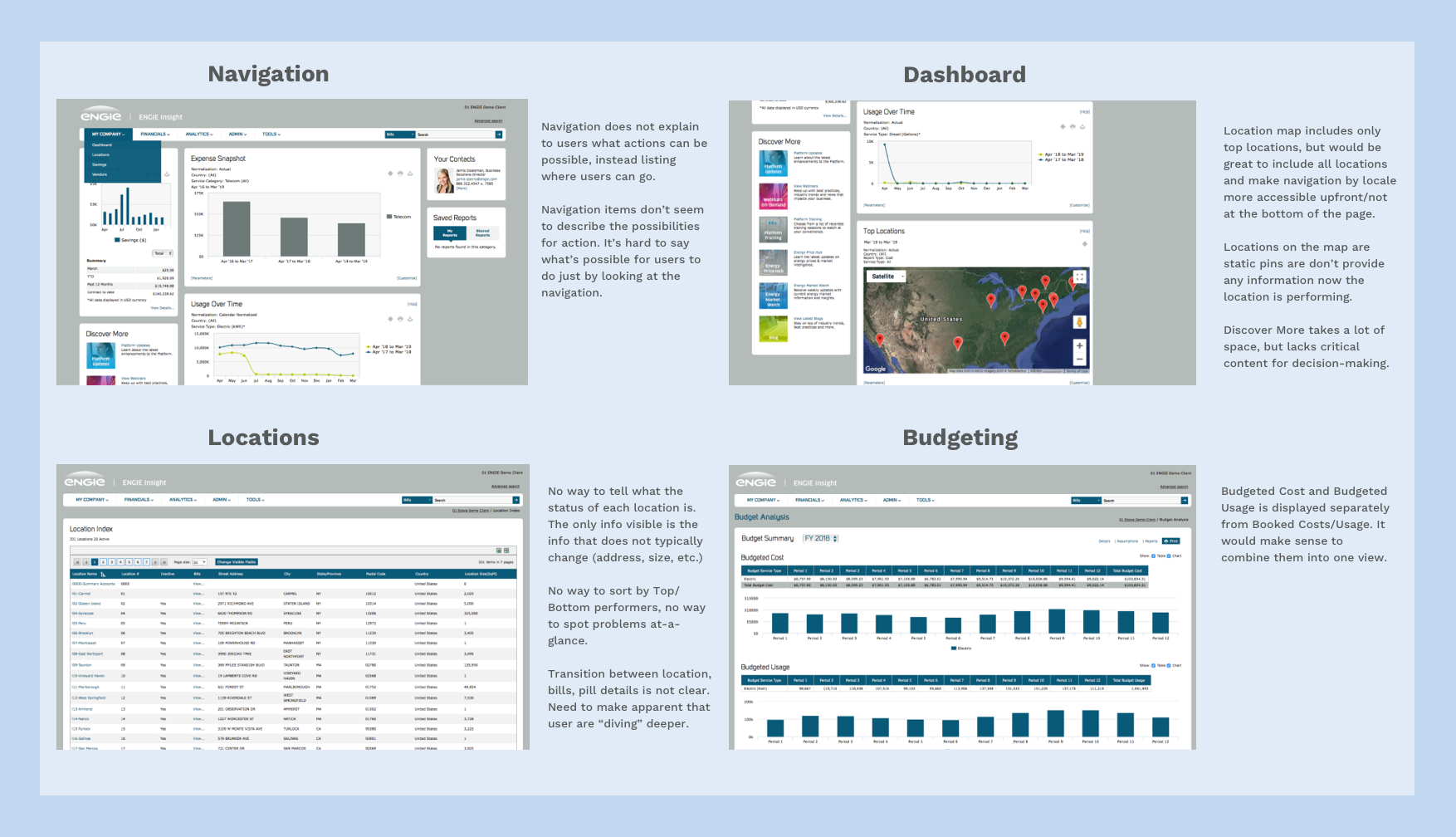
The following screenshots are from the user experience audit from when this project first kicked off. Through an analysis of the project, we designed overview design opportunities.
Feedback Collection Methodology
We met with the Engie team once per week to collect feedback and engage in project discussions. While we were working on the project, we used the following tools to help facilitate collaboration:
- Asana for task management
- Google Docs and Drive for file sharing
- Microsoft Team Meeting for discussion and screen sharing
- Sketch for design
- Zeplin and pdfs for design delivery
- Github for code sharing
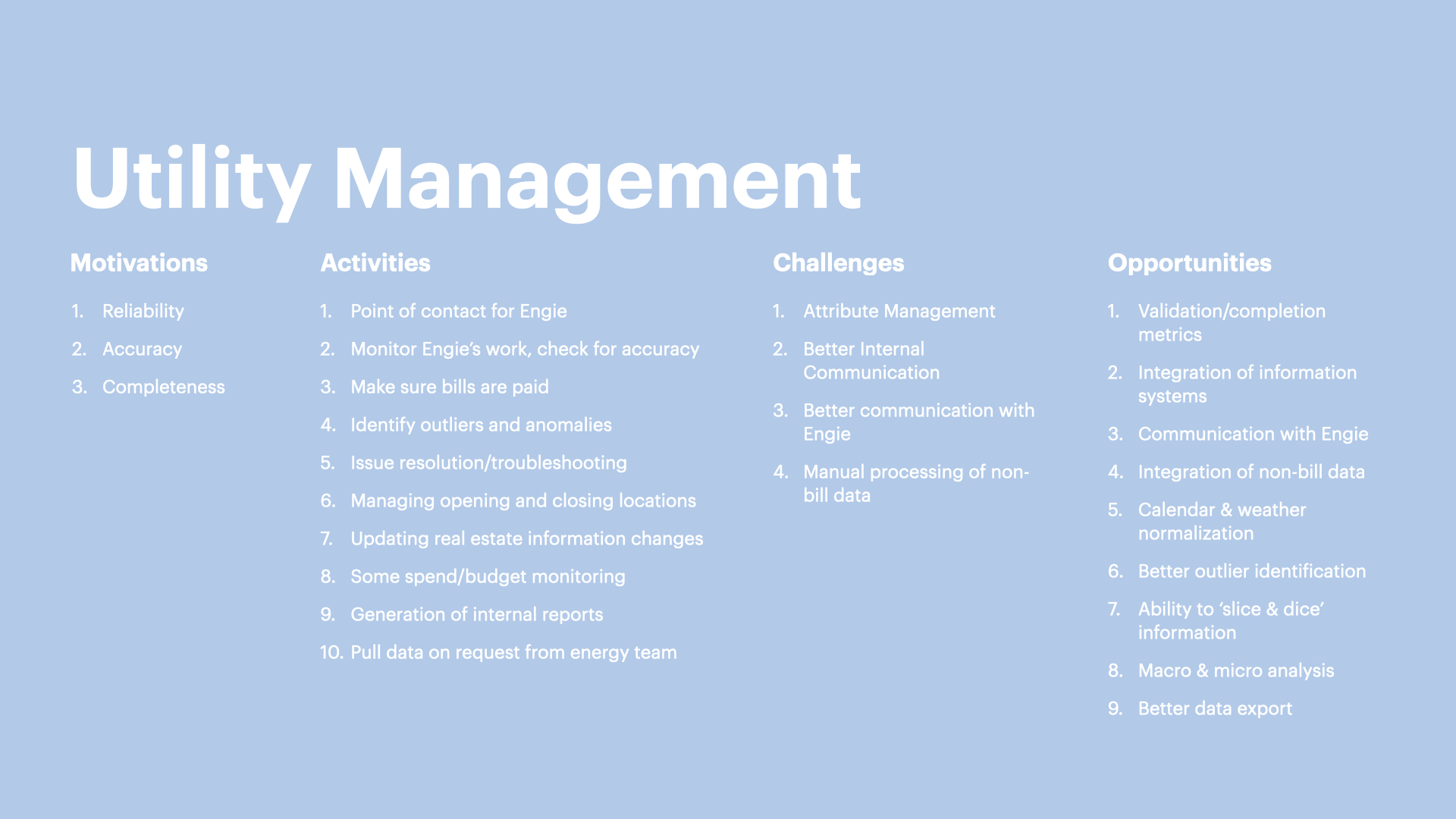
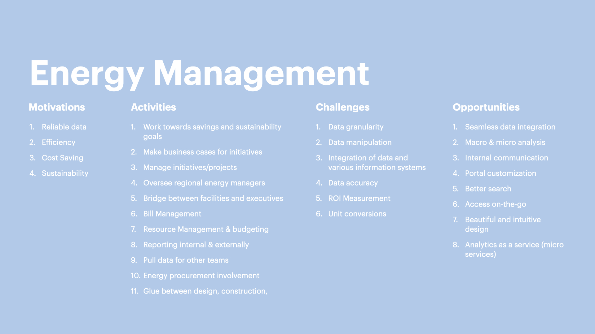
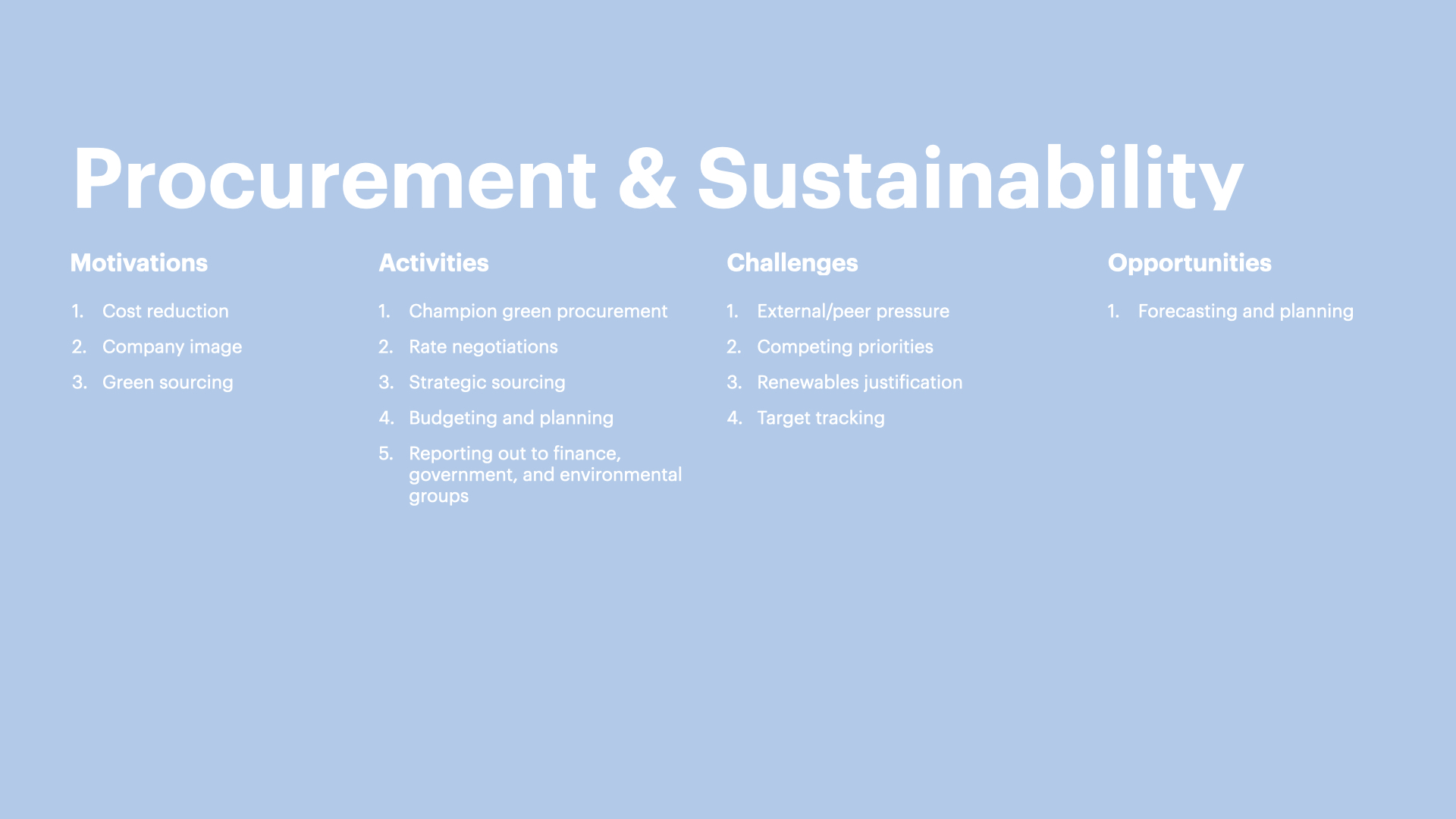
Our process included interviewing people working in utility management (5 people), energy management (8), and procurement & sustainability positions (3). Our design opportunities have been defined as a result of research synthesis based on their activities and challenges. The following screens show the summary of the research synthesis process.
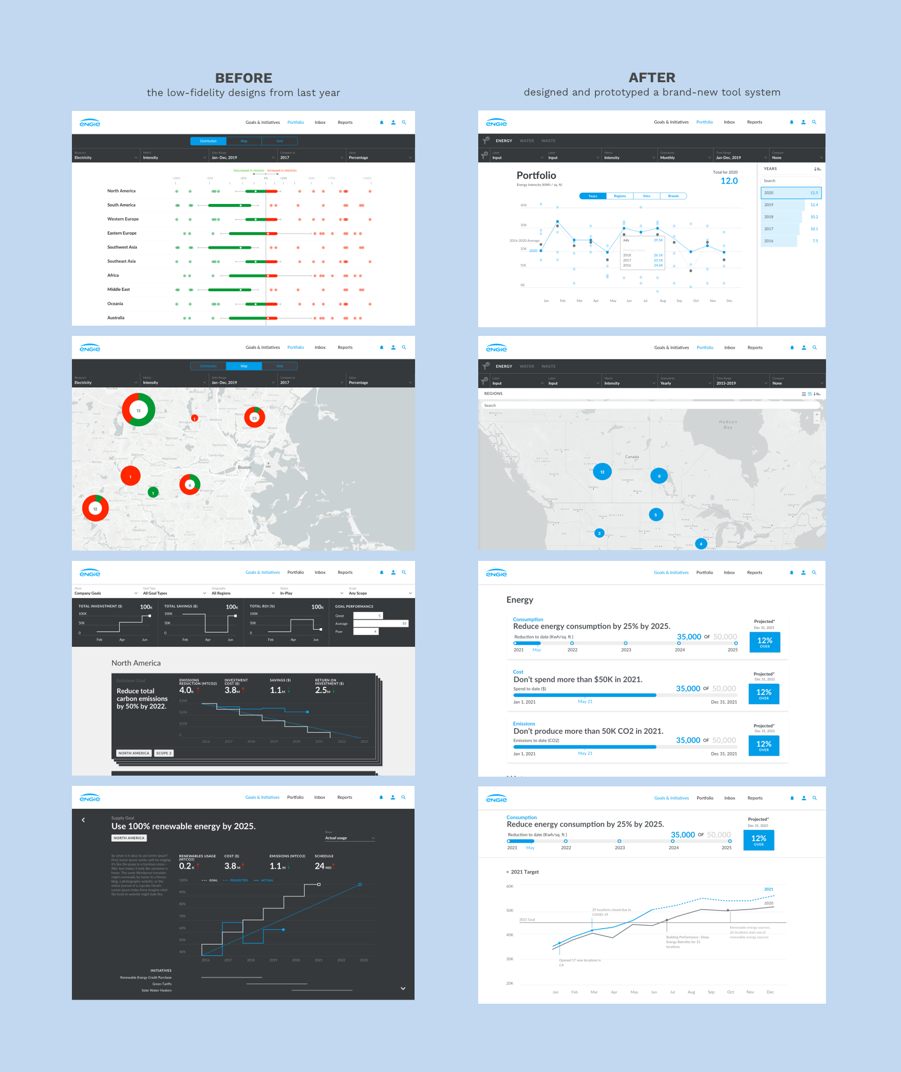
This year, when the project started again in March, we picked up the low-fidelity designs from last year as a reference. Engie’s needs had changed so we designed and prototyped a brand-new tool system for them to help them convey the breadth and depth of data so it would be more accessible to their clients. I was the main designer for this project and worked closely with my design director.
Design Opportunities
After discussion with the Engie team, we helped them turn their portal goals into design opportunities. We focused on designing and coding a demo for two sections of the portal: Goals & Initiatives and Portfolio.
Project Focus
For Goals & Initiatives section we focused on three objectives:
1. What are the sustainability goals, and is the organization on track to meet these sustainability goals?
2. What sustainability initiatives are being implemented, and how do they contribute?
3. How does the organization make use of various resources (energy, water, waste), and how does this affect their sustainability goals?
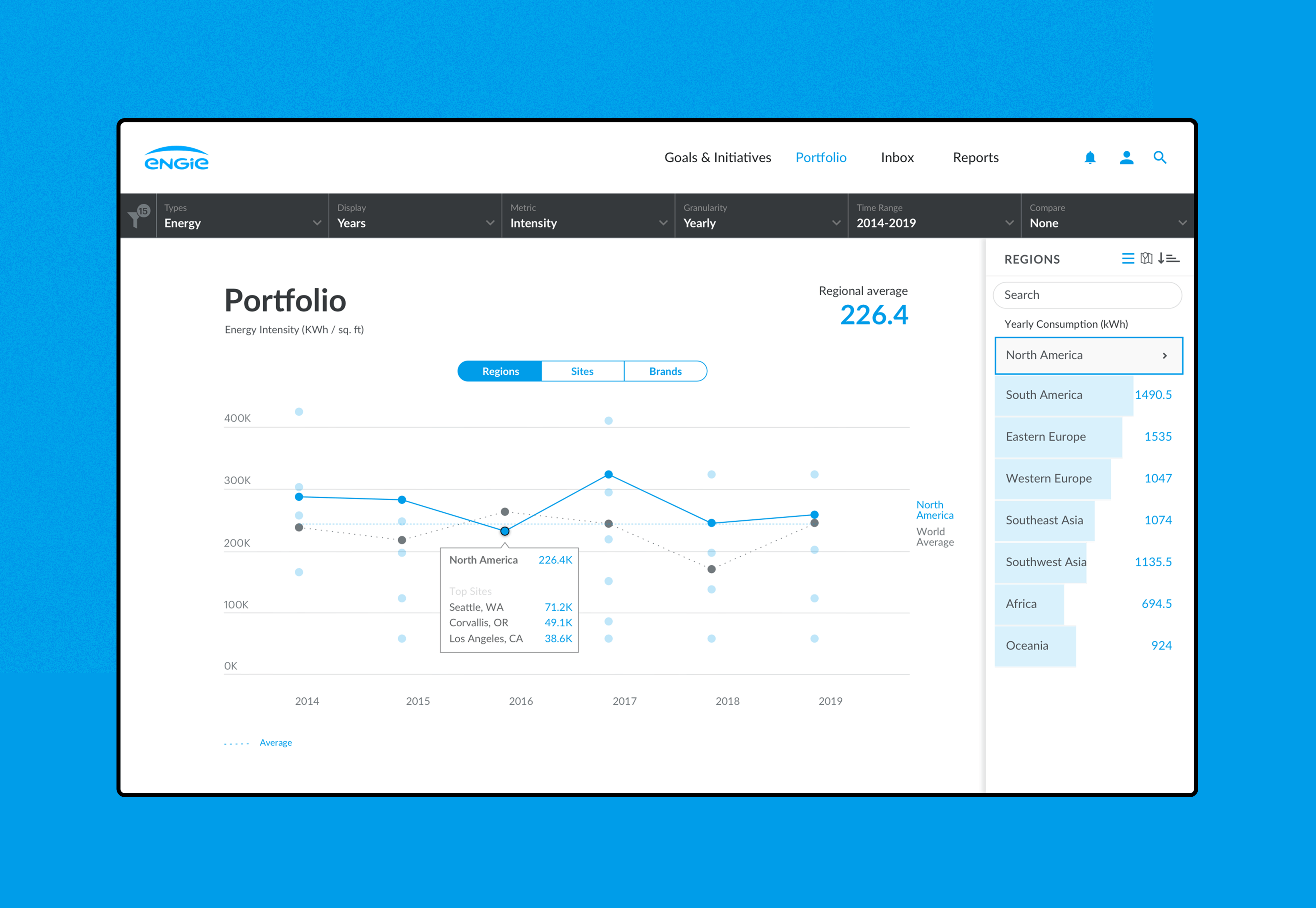
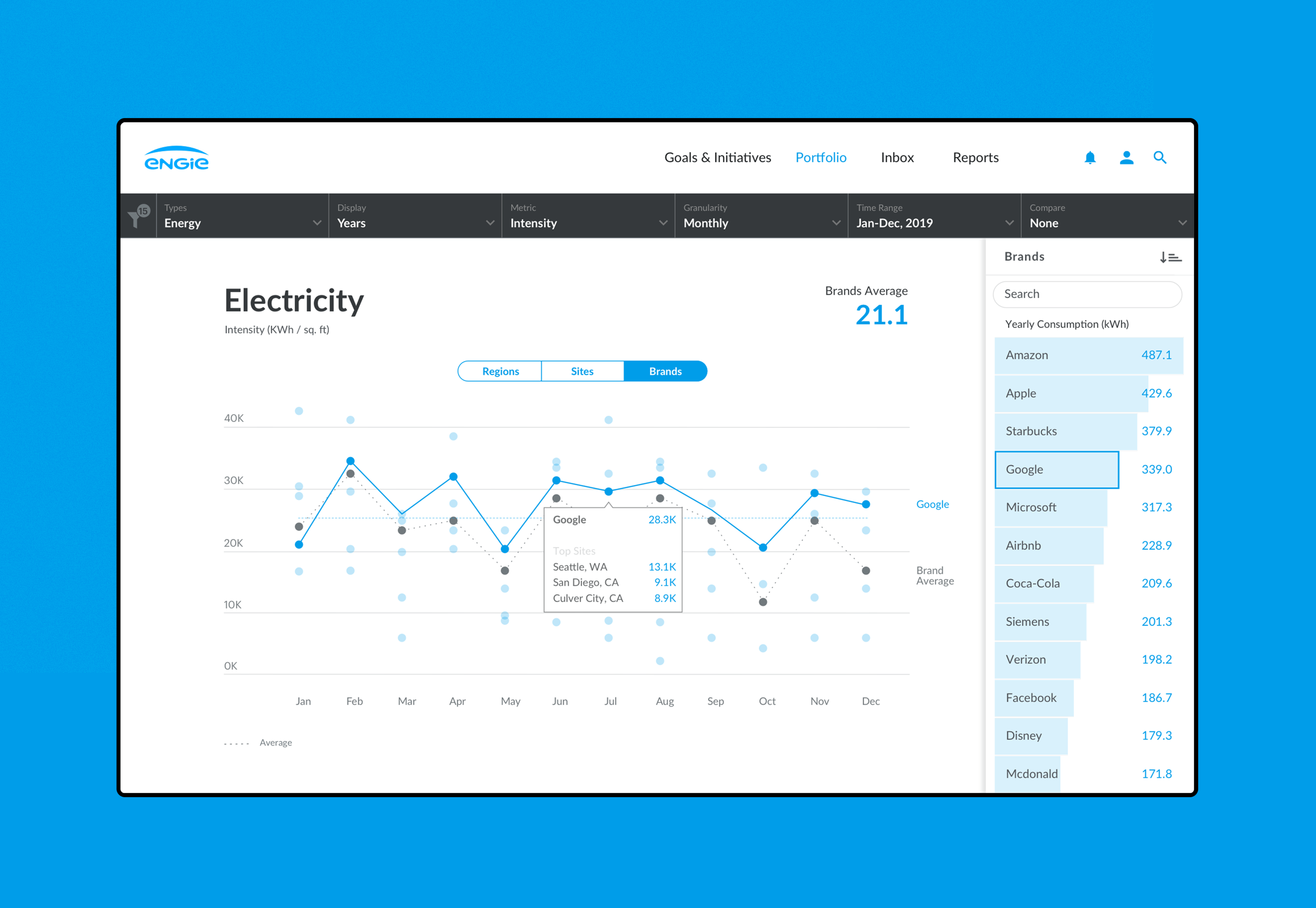
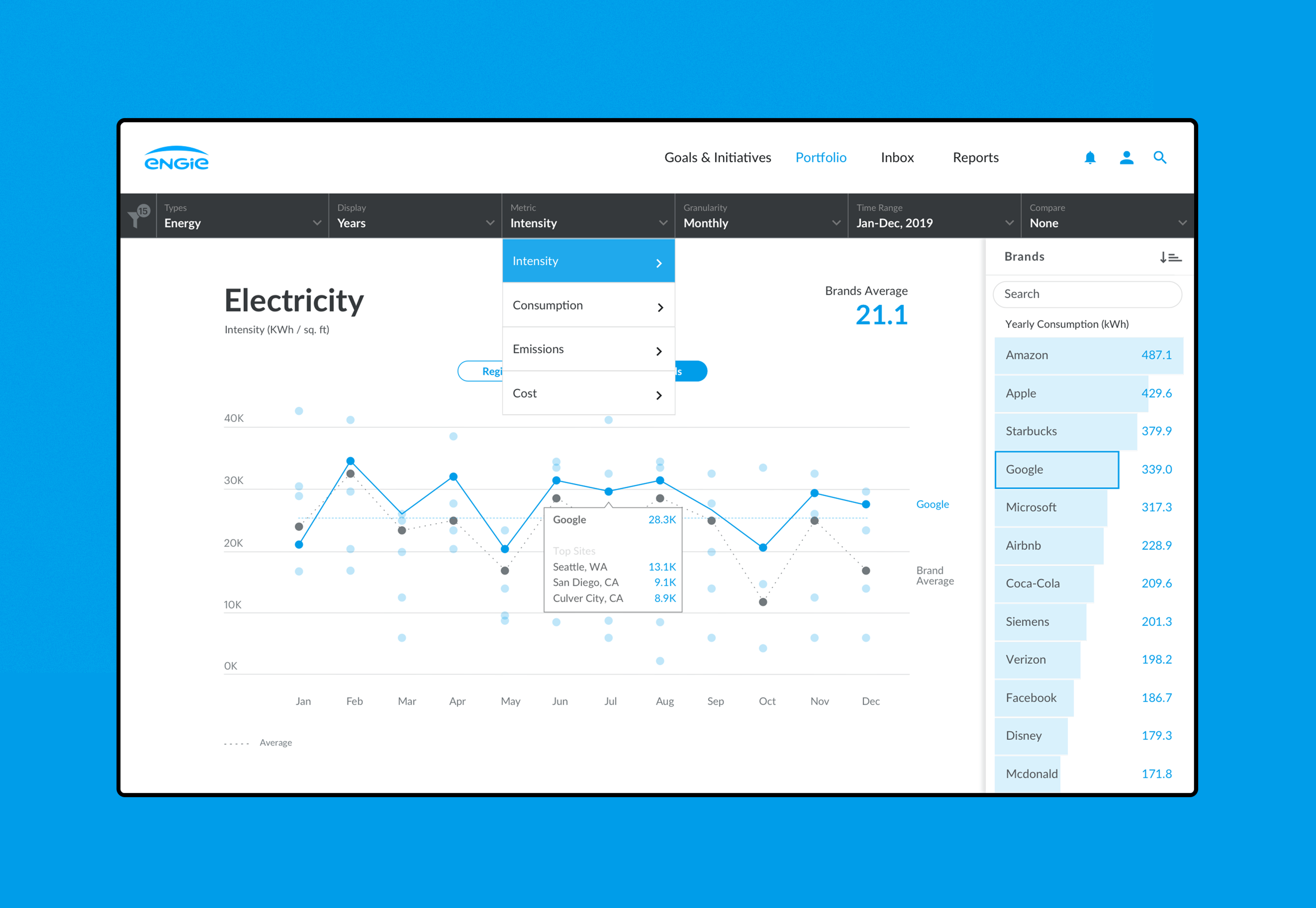
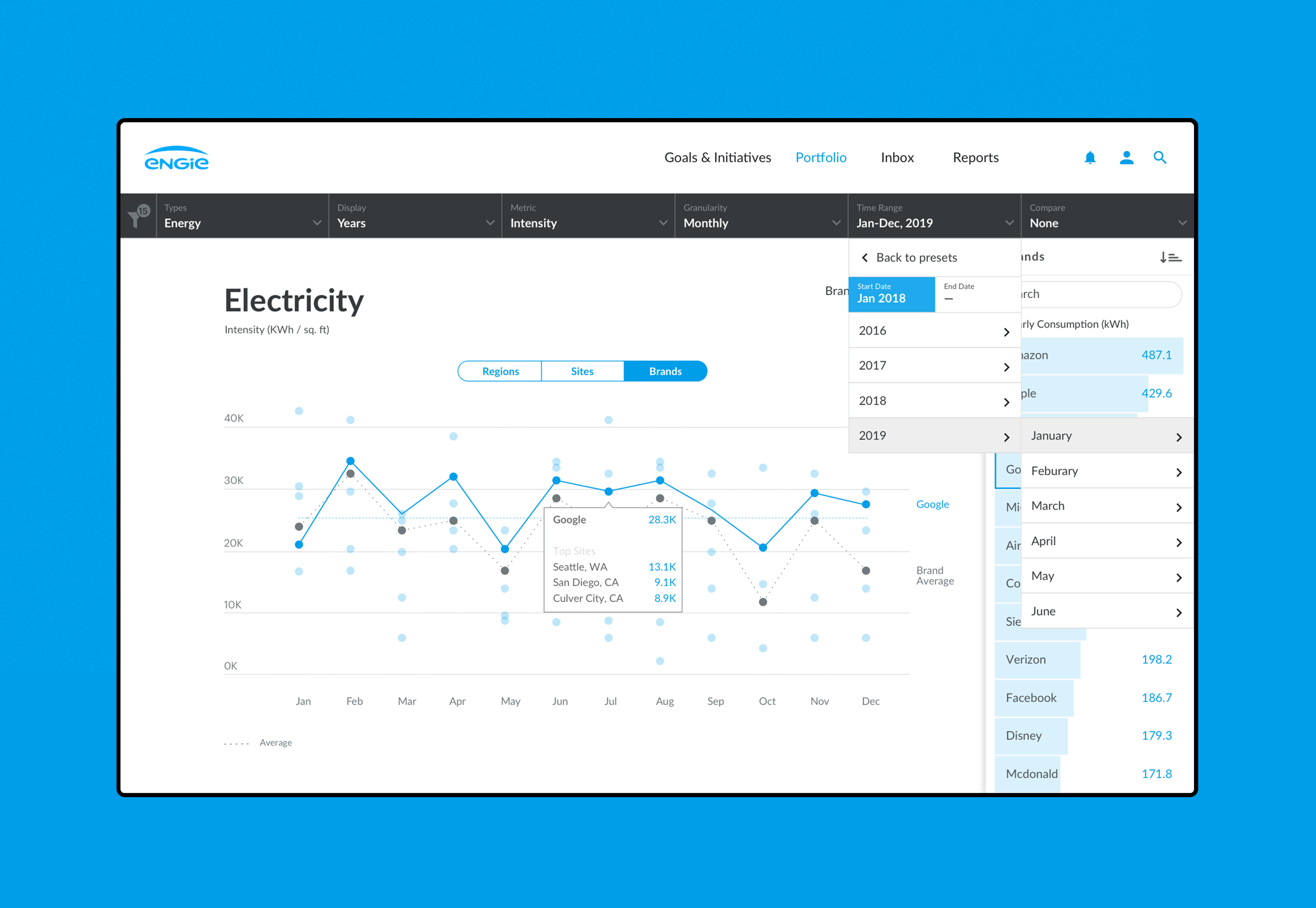
The Portfolio section was designed to show what regions, brands, and facility types are contributing most/least to the company’s goals and performance.
The following diagram shows before and after view of some key screens.
Design User scenario:
For potential users like Julia, she can use the new Engie client portal to compare differences in various Starbucks’ performance on sustainability goals in different regions.
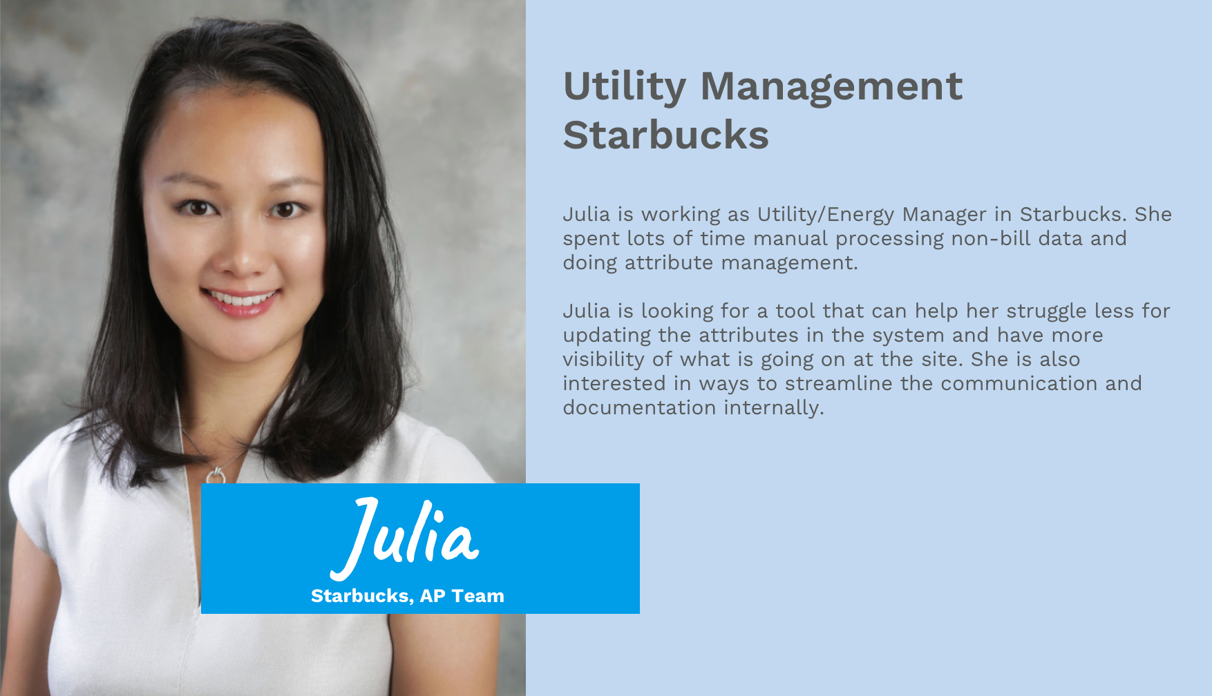
Julia is working as Utility/Energy Manager in Starbucks. She spent lots of time manual processing non-bill data and doing attribute management.
Julia is looking for a tool that can help her struggle less for updating the attributes in the system and have more visibility of what is going on at the site. She is also interested in ways to streamline the communication and documentation internally.
The following graphics highlight the screens Julia used most.
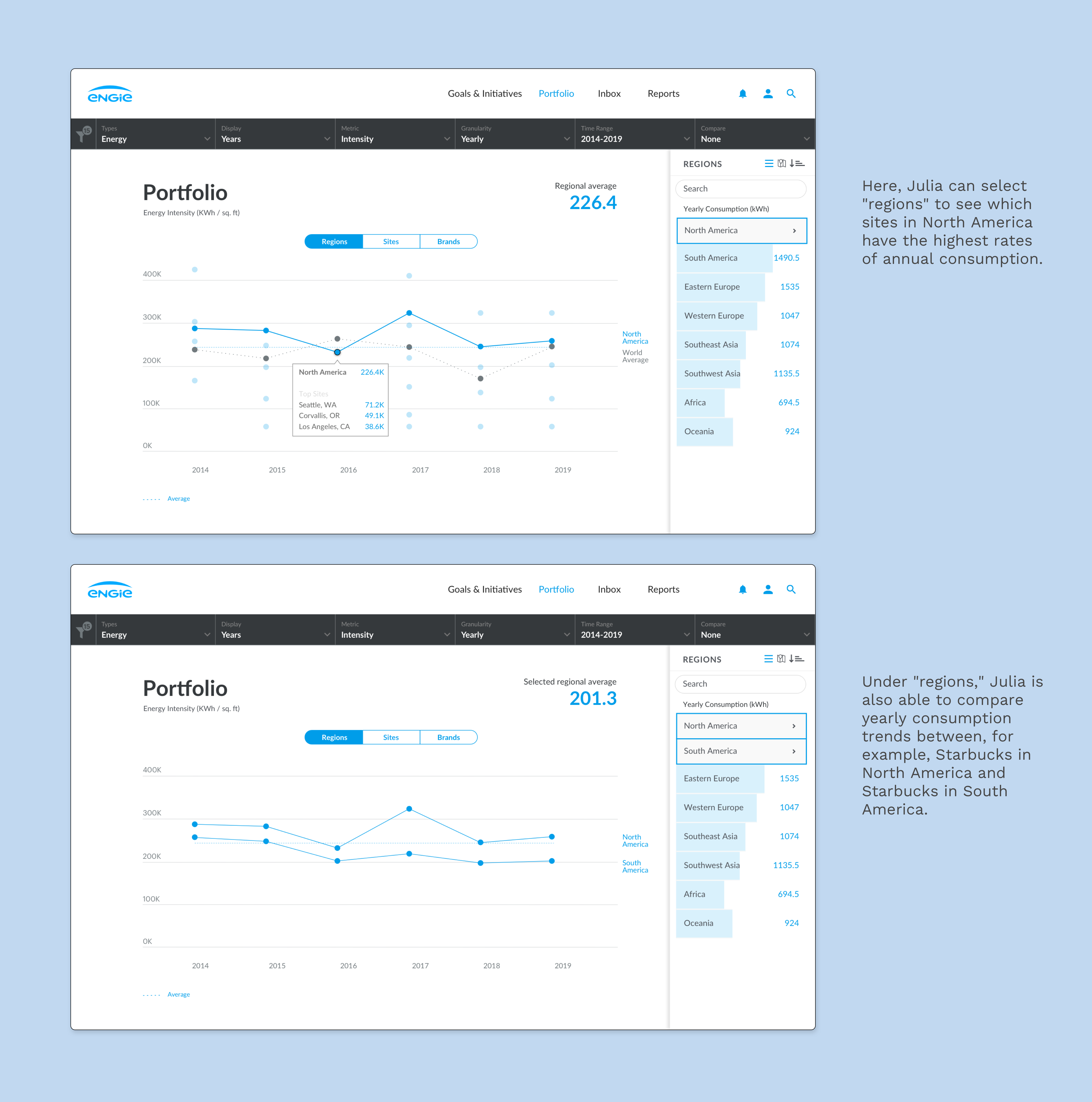
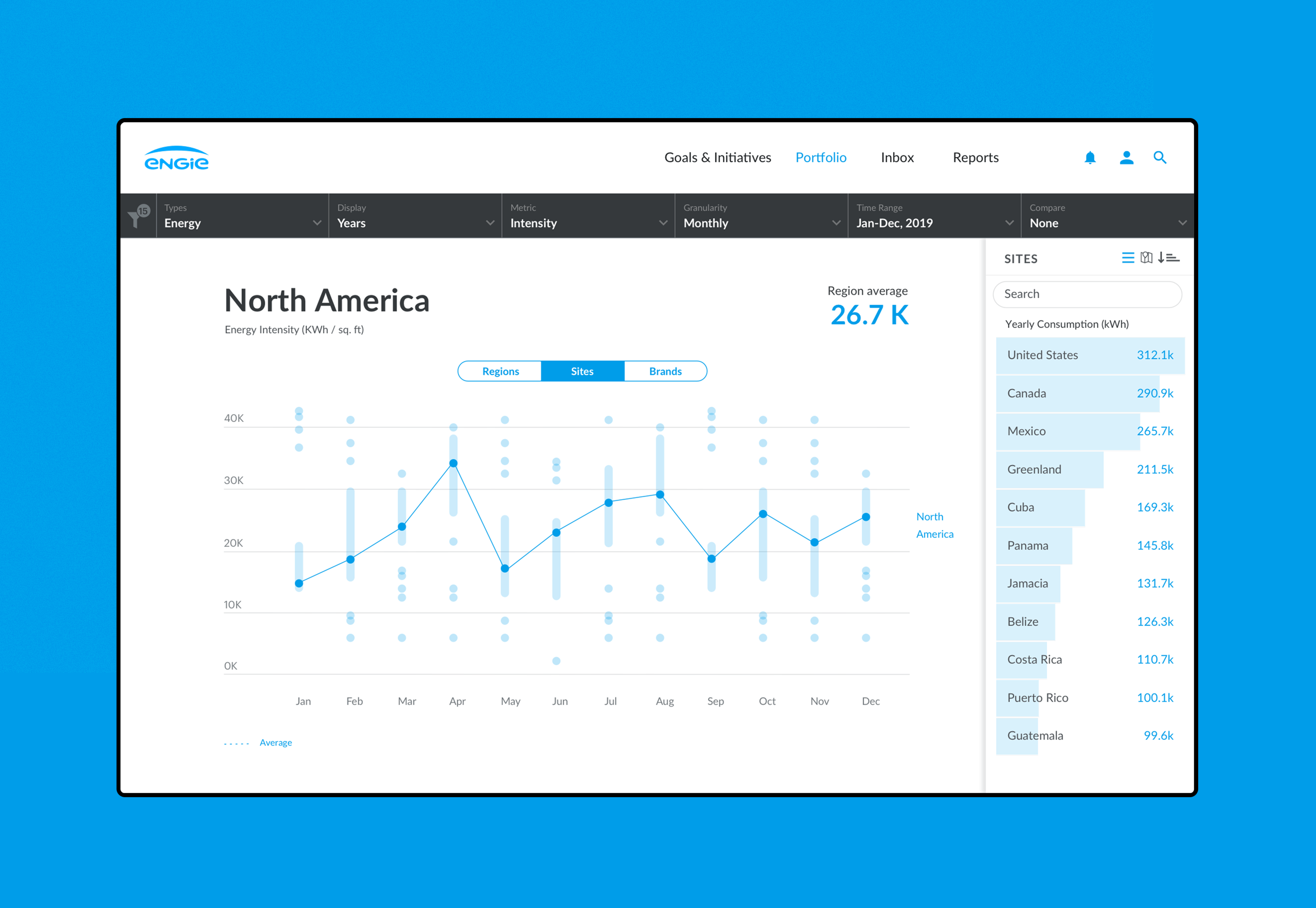
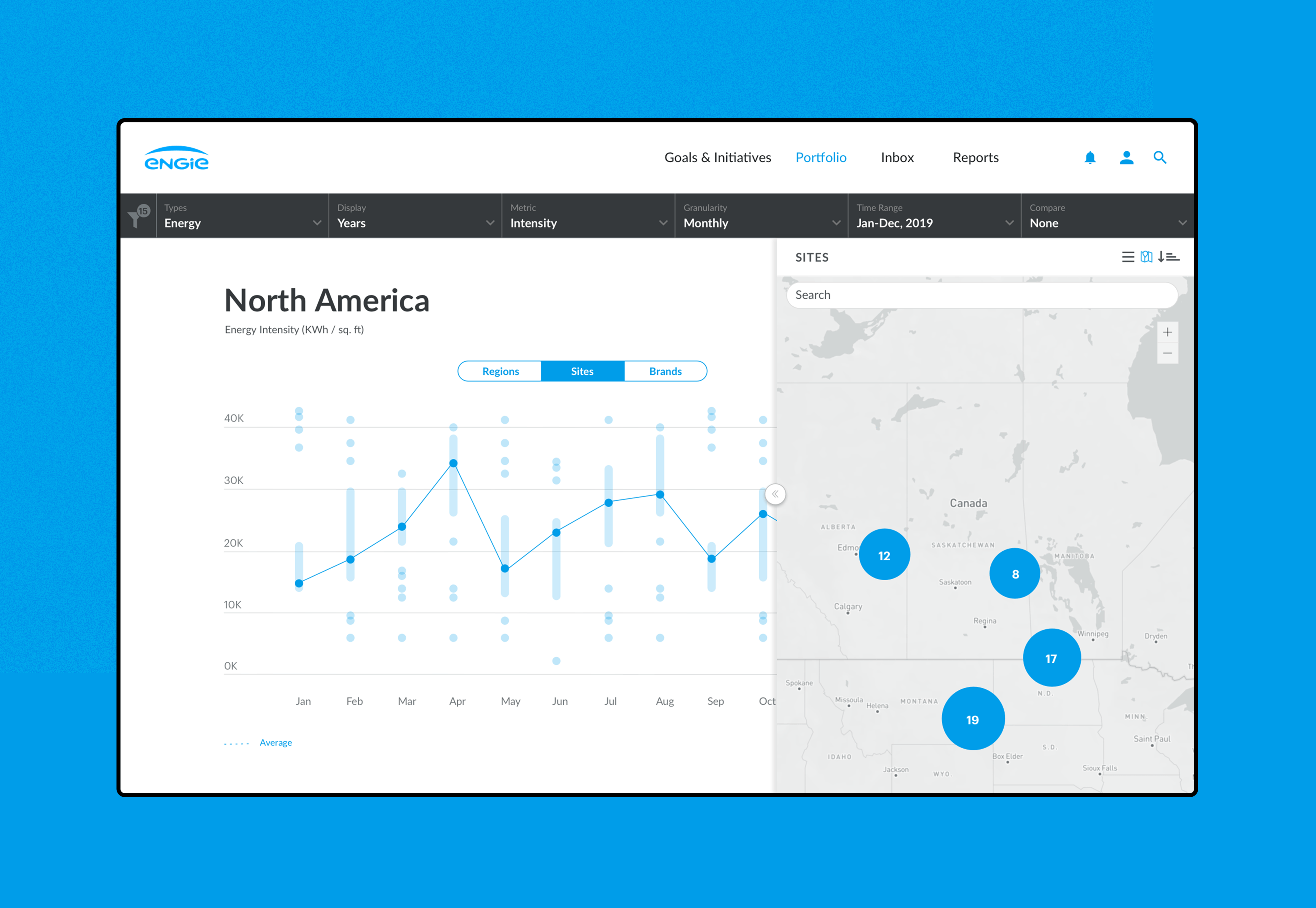
Here, Julia can select "regions" to see which sites in North America have the highest rates of annual consumption.
Under "Regions," Julia is also able to compare yearly consumption trends between, for example, Starbucks in North America and Starbucks in South America.
From the Initial Proposal to the Solution
During the early phase of designing the Portfolio section, we tested different types of visualizations. We discovered that while each selected visualization successfully communicated and represented the data, when all the visualizations were showing on one platform simultaneously, it became too overwhelming. To solve this problem, we decided to create a custom data visualization that combined a traditional line chart with a dot plot. Using this visualization, we tracked each company’s energy consumption by region and site. The following graphics show our exploration of these different types of visualization.
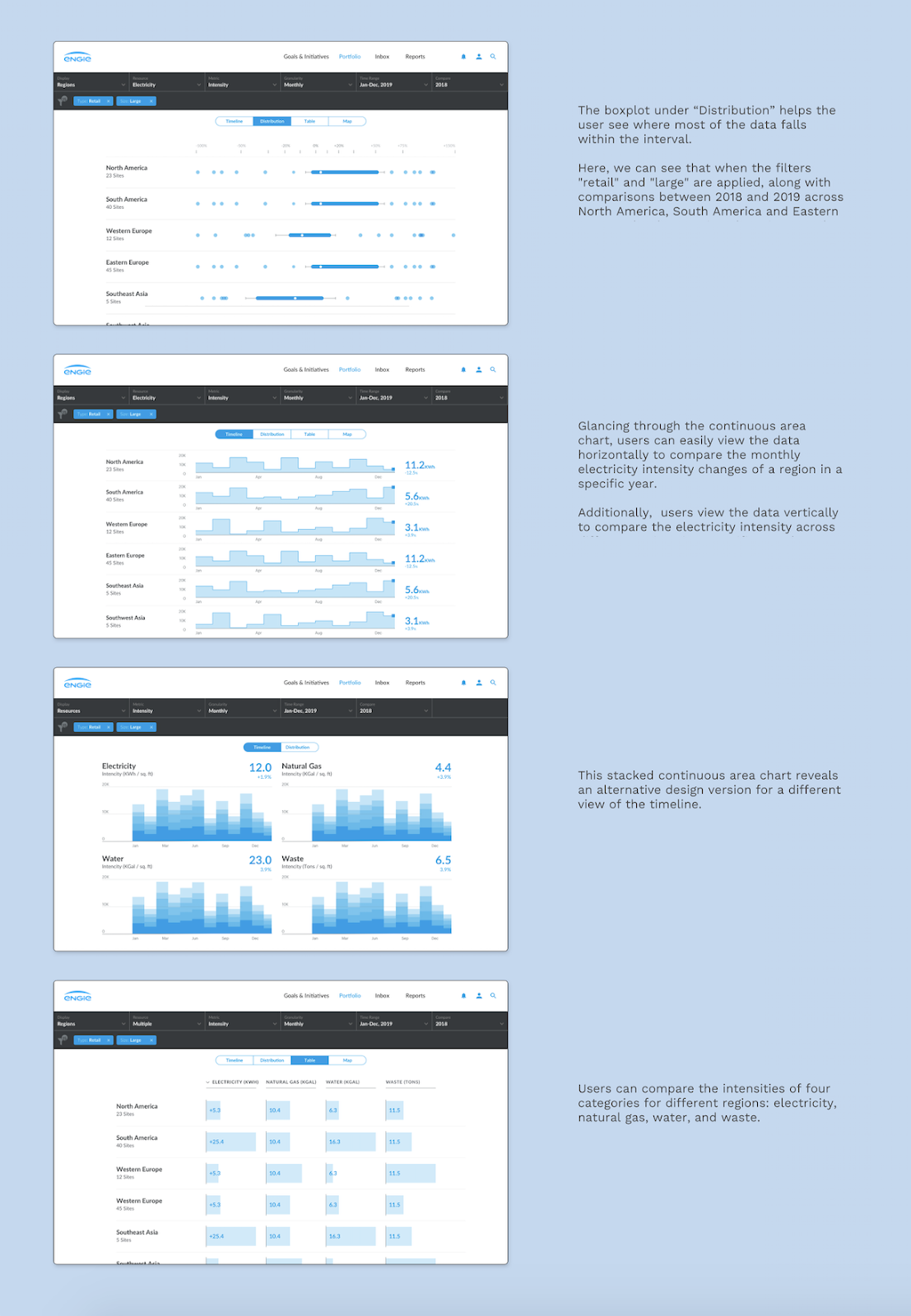
- The boxplot under “Distribution” helps the user see where most of the data falls within the interval. Here, we can see that when the filters "retail" and "large" are applied, along with comparisons between 2018 and 2019 across North America, South America, and Eastern Europe, the three regions have increased their use of electricity.
- Glancing through the continuous area chart, users can easily view the data horizontally to compare the monthly electricity intensity changes of a region in a specific year. Additionally, users view the data vertically to compare the electricity intensity across different regions in a specific month.
- This stacked continuous area chart reveals an alternative design version for a different view of the timelin
- Users can compare the intensities of four categories for different regions: electricity, natural gas, water, and waste.
Final Mid-fi Designs and Prototypes
The following are selected screens from the Engage Portal’s Goals & Initiatives section and the Portfolio section, which I was also involved with. I helped engineers take high-fidelity designs generated from Sketch and translate them into interactive prototypes to capture nuanced interactions and animations.
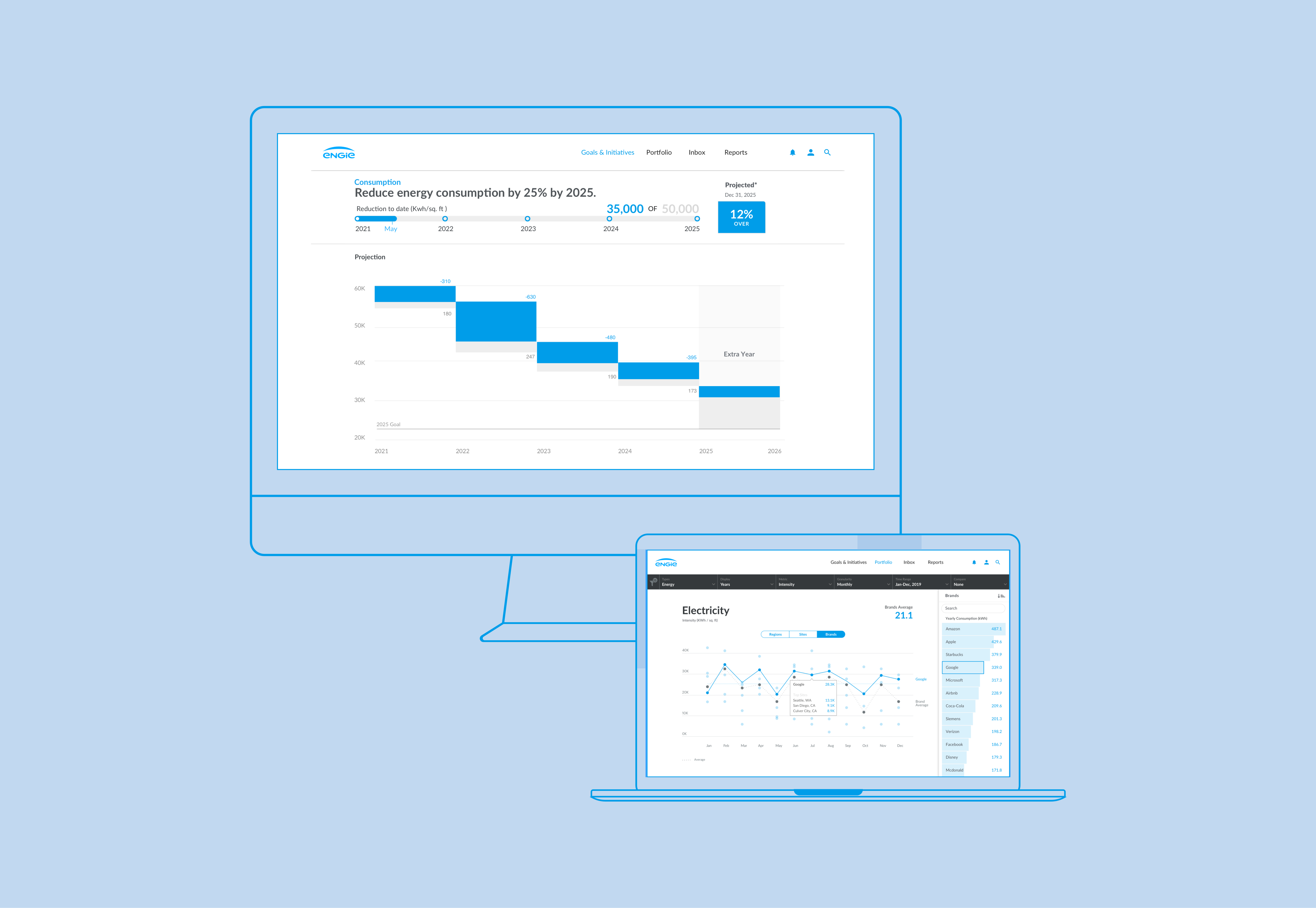
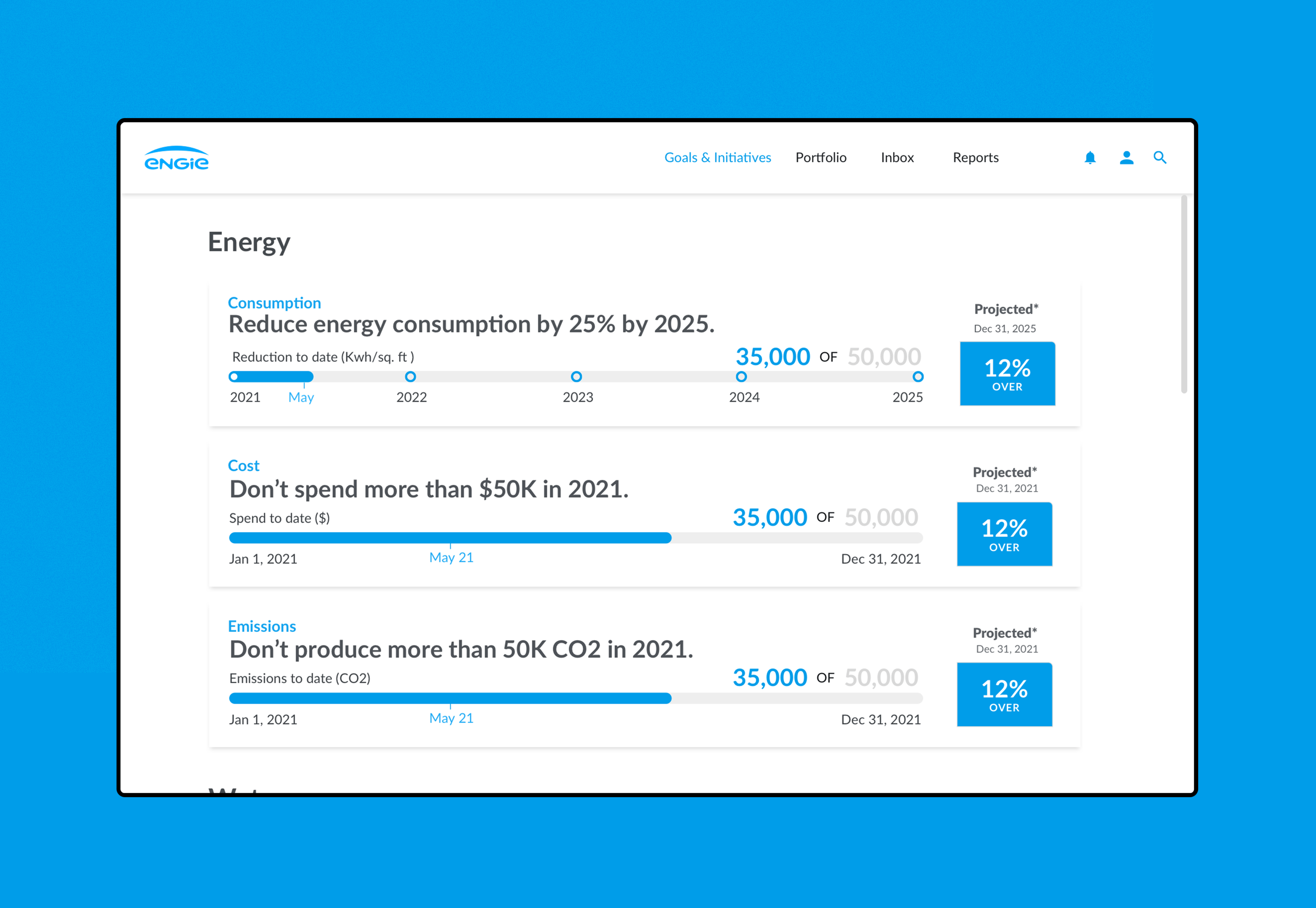
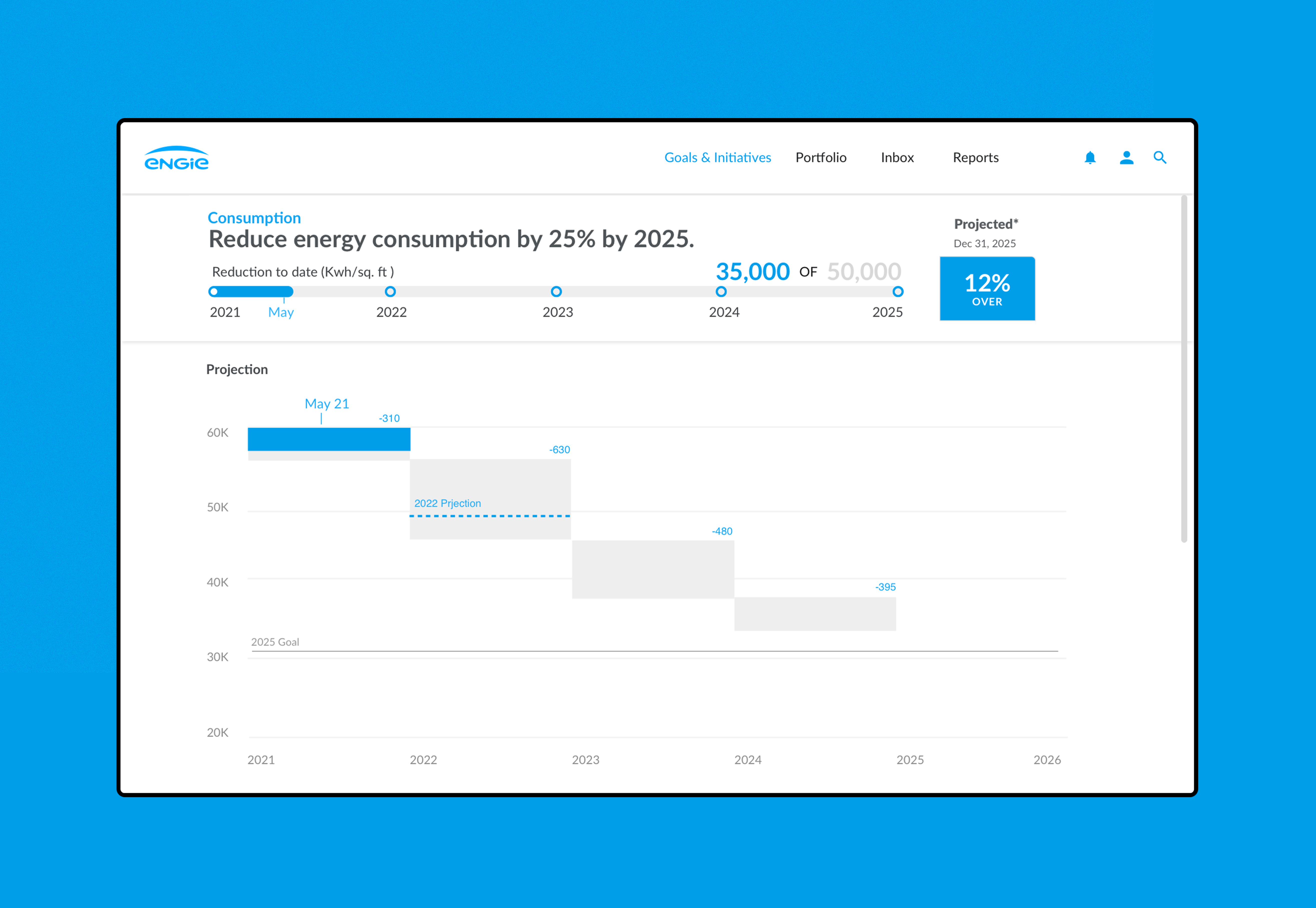
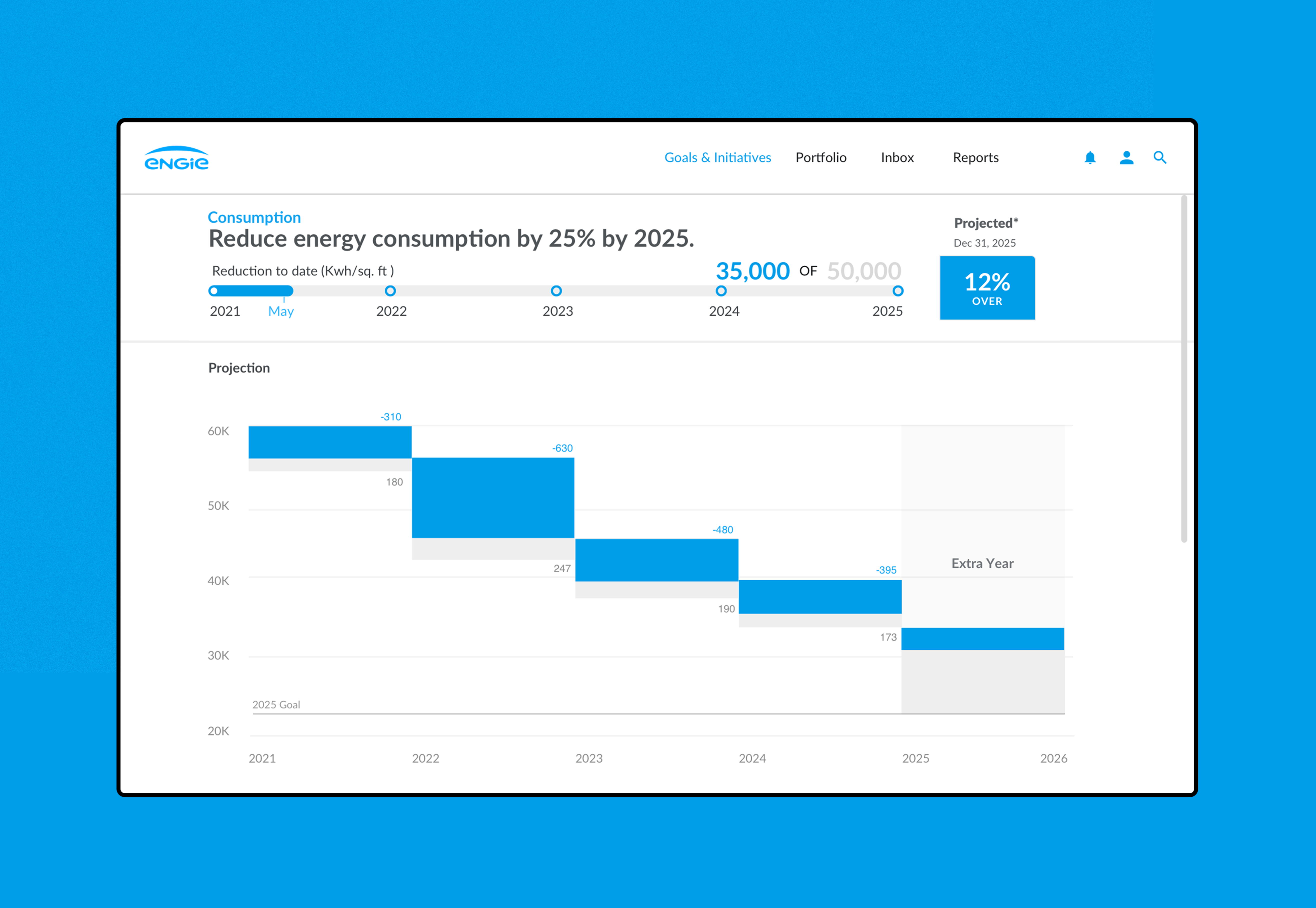
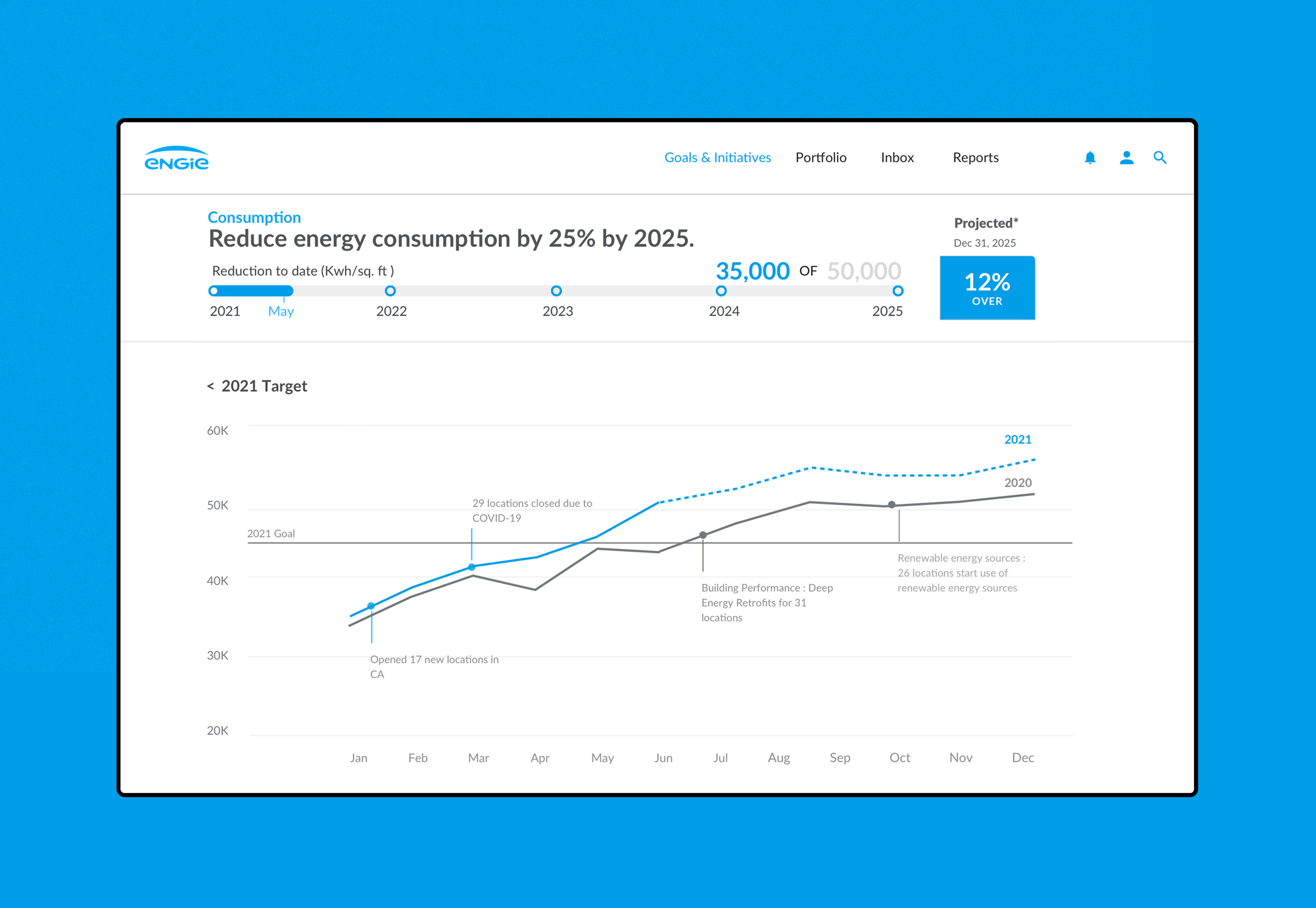
Goals & Initiatives:
Include a section to create and track resource/sustainability short term goals and long term initiatives.
Portfolio:
Portfolio section focuses on three different scopes, from regions, sites and brands. Different users can choose the scope they need.
Project Impact
Their engineering team started to use the design and code portal demo we provided to move forward with their internal discussion across departments to figure out where they want to begin implementation.