

Challenges and Target User
Data Collection
After comparing the pros and cons of current personal data collection platforms on the market, I choose two platforms to measure all of the time I spent on my smartphone and computer continuously through one week.
The first was Moment, a screen time tracking plugin on my phone, and the second is Rescuetime, a time management Chrome plugin.
Raw Data into Meaningful Categories
After the week of use, I grouped and analyzed the data by various category in Excel. My main question at this point was: How do I turn raw data into meaningful categories to classify data logically which would then allow me to facilitate the process of thinking about the next visualization options? After exploring different methods of grouping, I found a balance between the number of groups in a way that reflects my individual lifestyle.
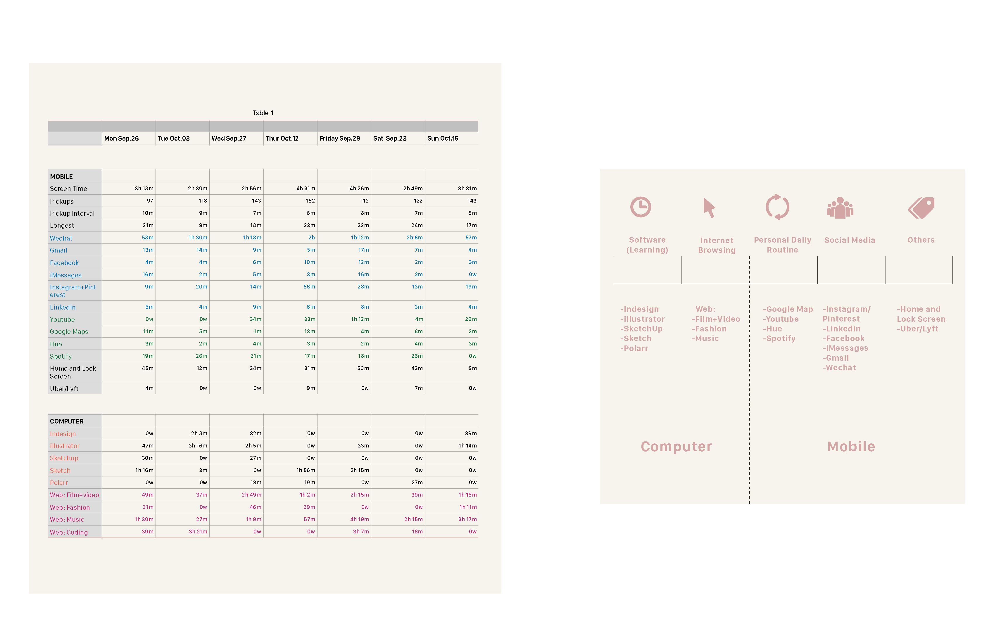
I divided the time I spent on my computer between software and internet browsing, which each had their own subcategories. I separated my mobile media usage into three main categories: personal daily routine, social media, and “others.” The personal daily routine represented the apps that I do not necessarily spend a lot of time using, but that I use almost every day, like Google Maps. Social media included apps like Instagram as well as LinkedIn or Facebook. The “others” category included things like ride-share apps and home and lock screen.
Exploring Visualizations through Design Iterations
After I compiled and organized the data with the new categories, my next challenge was figuring out how to represent this personal dataset in creative ways that would reflect my lifestyle.
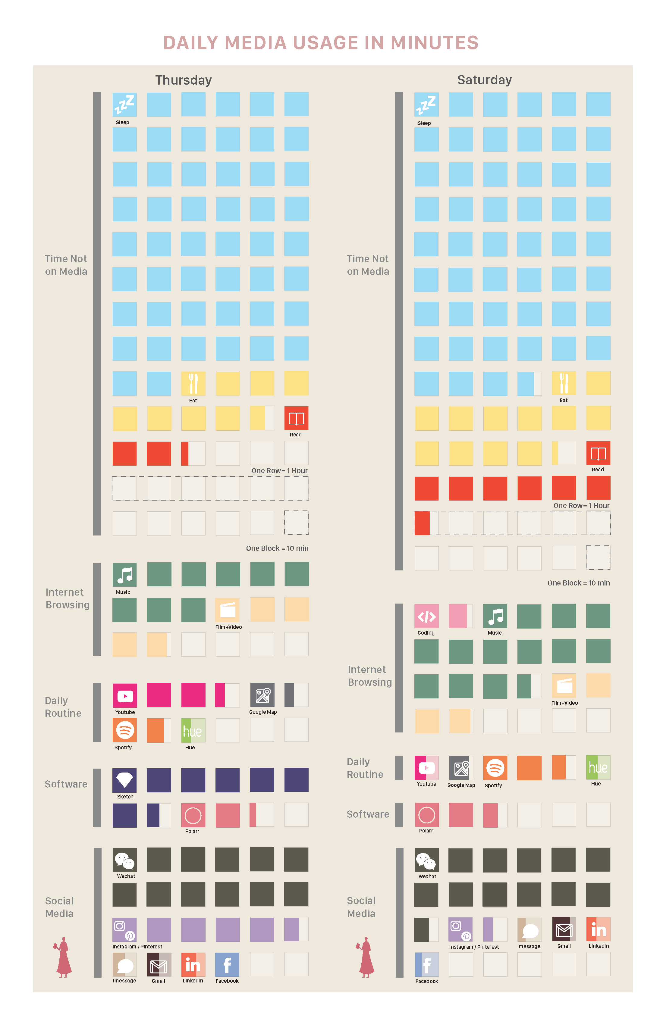
First Design Attempt: Translating Media Usage into a Poster
My first visualization attempt was visualizing media usage in a poster format. The main purpose for this idea was to allow me to compare the time I spent on my activities that were not on media versus those that were, all in chart. On the chart, the smallest unit represented ten minutes, and each row consisted of six basic units representing one hour. Each unit was color-coded for the activity I did within that time.
Self-reflection and Design Validations
Pros and Cons:
One pro for this chart included the idea that when I picked one weekday and one weekend day and put them side-by-side on the poster, I was able to clearly see my different media usage habits between weekdays and weekends. For example, in this sample, I obviously spent more time online on the weekend when compared to the workday.
A con for this chart was that I need to calculate each unit in order to know the time I spent on each activity. As is, it was particularly difficult to calculate the time for activities that did not take up a full grid.
User feedback:
“This shows a lot of details of media usage, even down to specific apps. I like the details, but I also have to do a bit of work to understand the overall picture.”
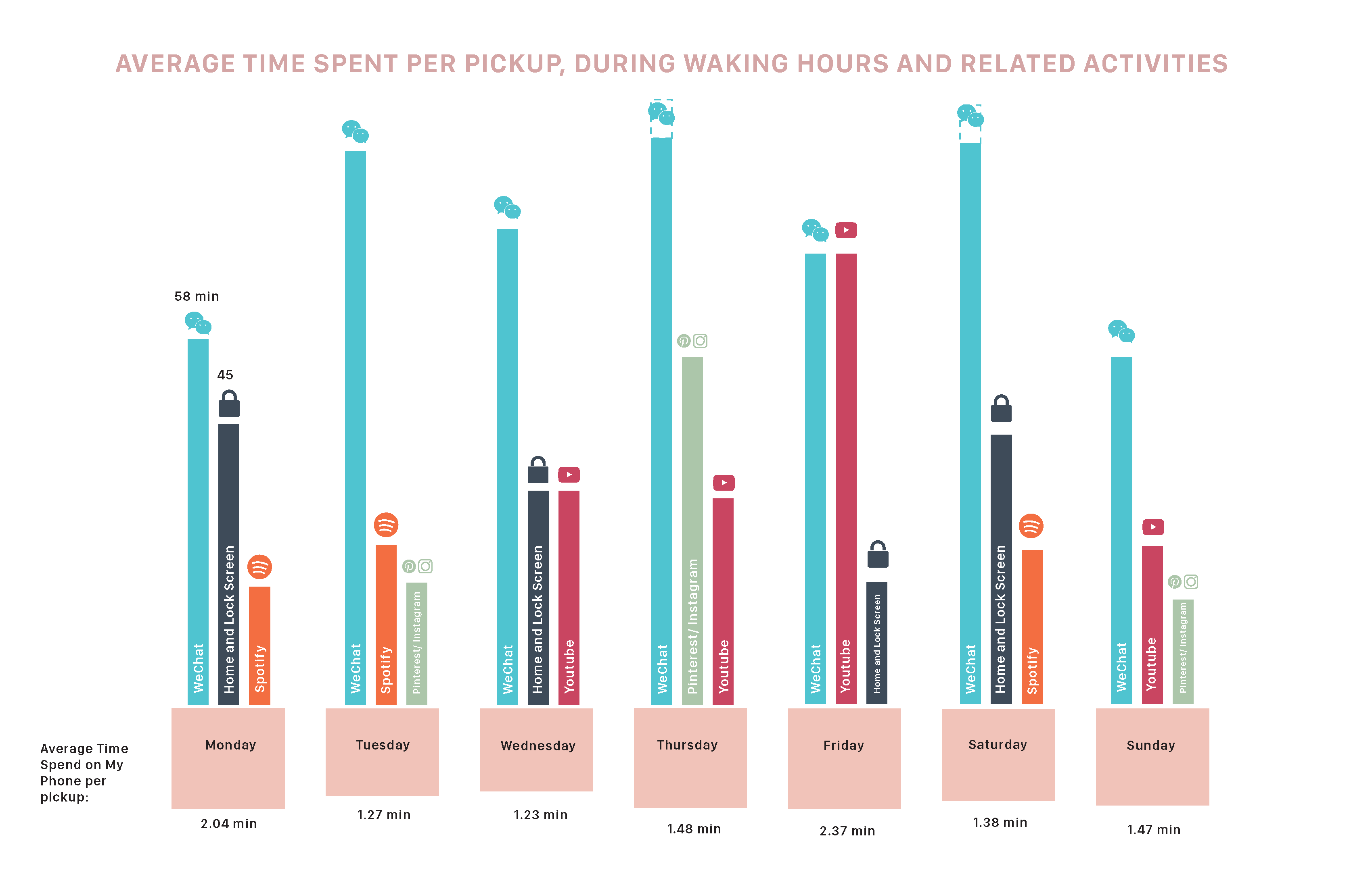
Second Design Attempt: Charting the Apps I Spend the Most Time On
Based on the feedback from the first design attempt, I decided to reduce the amount of information shown in the graph and focus on charting the apps I spend the most time on. I selected the three apps that I used the most on a daily basis. I then compared that time to the average amount I spent on my phone per pickup to see if there was any correlation.
The following chart contains an example week, and as you can see, since I used to chat with my family on Wechat every day when I was commuting, Wechat was the app that I used the most. Furthermore, there is no apparent correlation between the average time spent on the phone per pickup and the top three apps.
Self-reflection and Design Validations
Pros and Cons:
The pro of this chart was that the 3 most-used apps per day are prioritized on the chart. The downside is that it lacks any storytelling behind the data, and the relationship with another variable (average time spent on the phone per pickup) is not clear enough.
User feedback:
“The bar charts about time on apps are very clear to me. I had difficulty comparing the average times spent on the phone per pickup. Maybe because the bars are pointing downwards?”
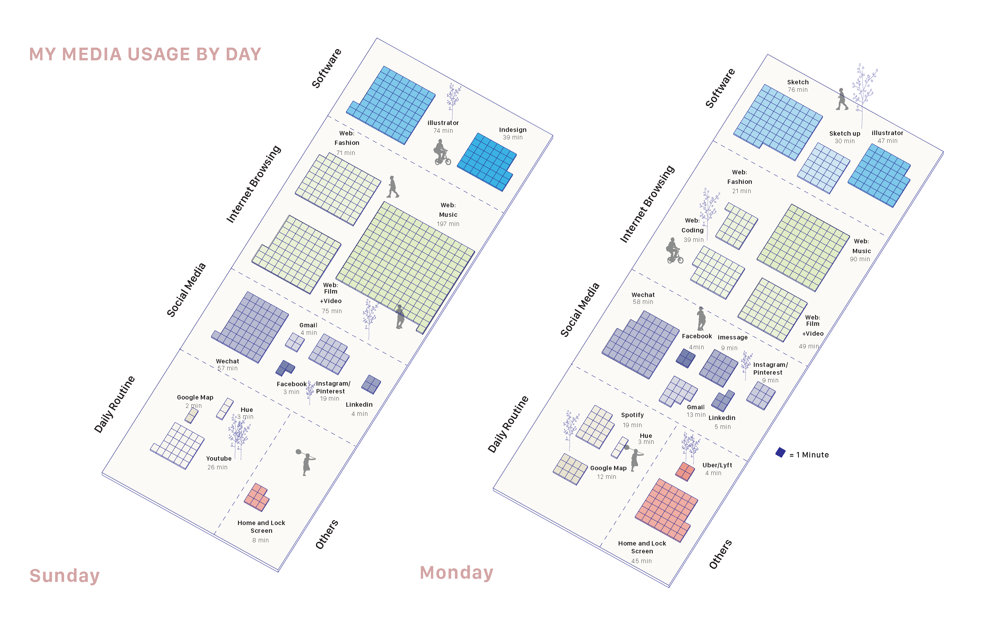
Third Design Attempt: Diagramming Time Through Volumes and Space
From the third design attempt, I wanted to focus more on exploring data visualization storytelling. Here, I focused on time diagrams through modular volumes and space. Each square represents one minute. One can imagine that the total garden area is represented by 24 hours. In this large garden, the different subdivisions' size was determined by media usage on that day. The virtual garden was reshaped every day to reflect the different ways of using the phone and computer, as each day's schedule was different.
Self-reflection and Design Validations
Pros and Cons:
The pro for this visualization is I found a way to clarify data, rather than simplify information. The con includes that I was visually unsure of finding the best way to express the virtual garden idea.
User feedback:
“I like the metaphor of garden and squares clearly showing the time distribution. However, it could be difficult for me to see the trend across multiple days.”
Fourth Design Attempt: Turning Media Usage into a Virtual Building
My final design attempt was to convert daily media usage statistics into a virtual building. The height of the building would be determined by the number of pickups in a given day and the length of the building would be determined by the time spent on the phone. At the end of each week, a new street block of 7 buildings would be created. As time goes by, blocks will eventually form a unique virtual city pattern based on one’s media usage.
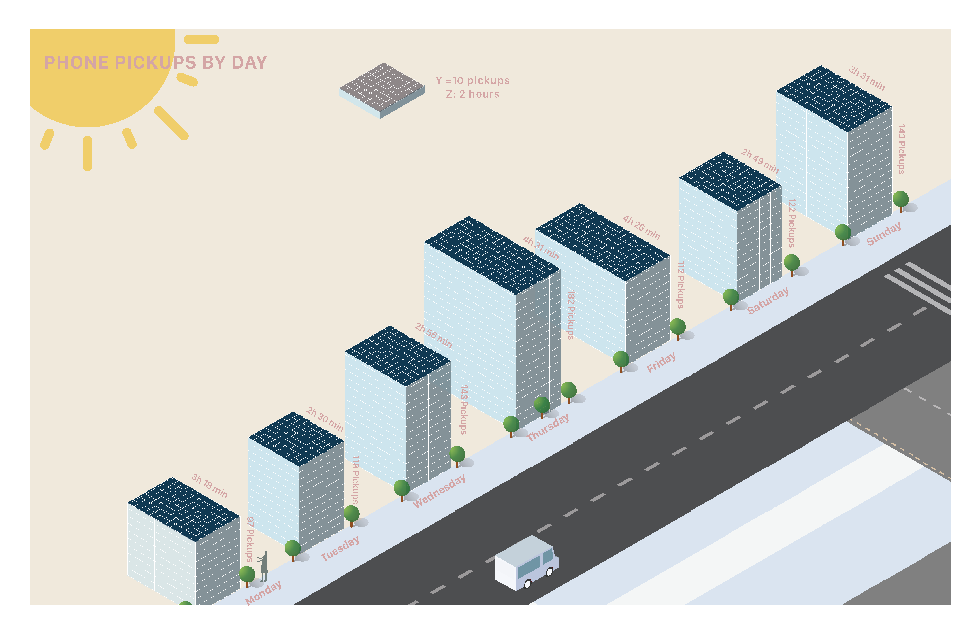
Self-reflection and Design Validations
Pros and Cons:
The pro of this visualization is expressing the story in an engaging way and with a clear visual analysis. The con is that I haven’t had a chance to explore the transformation from “street block” to “media usage city.”
User feedback:
“I like the simplicity of this one. The time spent on the phone and number of pickups are probably the most powerful indicator of media usage. The buildings clearly show the effect of these two measures.”